The website aims to democratize data visualizations. Data visualizations can ease decision making and necessitate accurate predictions. Moreover, another goal of the website is to share Michael Otis's journey of self-learning Data Science.
Github: Michael Otis
Github Organization(s): Edmonton Open Data
Bl.ocks: My bl.ocks
Observable: My Javascript Notebooks
Contact Email: mikelotis123@gmail.com
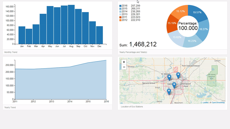
An improvent of Eco Station I
Best viewed in: Google Chrome (Desktop and mobile Dashboard)
To-do: Apply Joey Cherdarchuk findings
CLICK ME FOR DASHBOARD II
Larger map display, row and bar chart addition, and map encapsulating selection
options are some improvements to Dashboard I.
Data used in Dashboard II is similar to Dashboard I. Dashboard II's code is more efficient,
maintainable, and scalable.
Inspiration for the Project: Mean Daily Temperature Extremes and drive to complete
crucial To-do's
Frameworks used include: Leaflet.SlideMenu, FontAwesome,
Spin.js, and same frameworks as Dashboard I
Desktop and mobile Dashboard: BYLAW INFRACTIONS DASHBOARD II (CLICK ME!)
Note: FAILURES OF DASHBOARD I MADE DASHBOARD II A REALITY
| No. | Dashboard I | Dashboard II |
|---|---|---|
| 1 | Wrote code in the constraints of Le choropleth and Interactive Data Visualization | Learning responsive basics facilitated desired improvements |
| 2 | Not taking time to understand arising issues | Understood arising issues using global variables and Document Object Model |
| 3 | Intimidated by Mean Daily Temperature Extremes code and didn't extract needed code | Diving deeper into d3.js, dc.js, leaflet.js, dc-addons.js, and bootstrap docs aided in code efficiency |
| 4 | Abruptly used researched examples without deep thought | Mathematical procedures and operations are paramount for responsiveness |
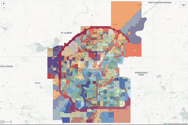
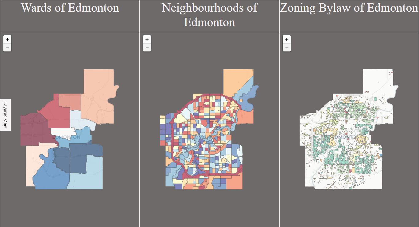
Purpose: View and explore Wards, Neighbourhoods, and, Zoning Bylaw of Edmonton
Best viewed in: Google Chrome (Desktop and mobile Map)
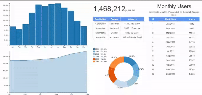
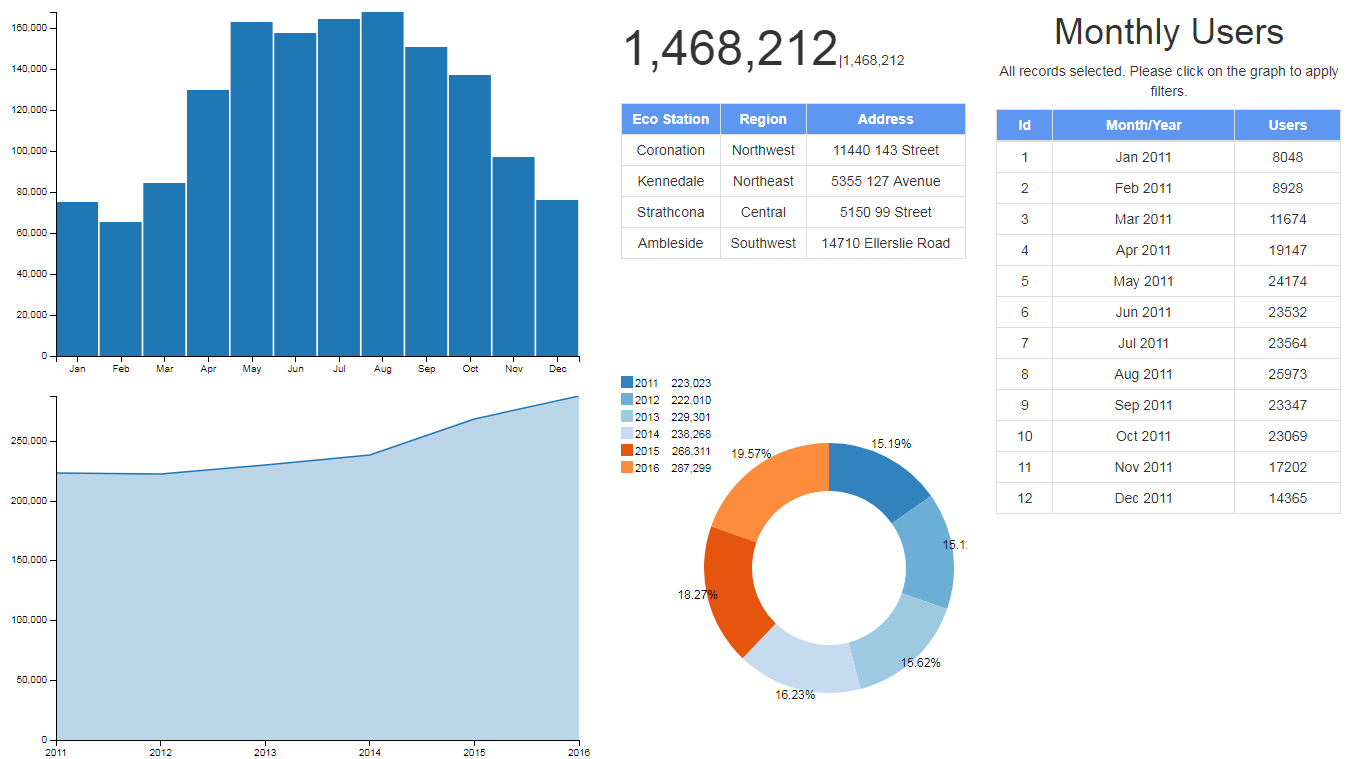
Uses data acquired from Open Data (City of Edmonton) to
analyze yearly and monthly trends of Eco Station users. Users can filter by month(s) or by year(s) to view desired trends. Filterable charts and
the dashboard have a reset method. 2017 data is not included in this example thus, 72 rows are selected out of 80 rows.
Inspiration for project: DC.js for Data Science Essential Training and
Crossfilter Data Science Essential Training
The frameworks used include: crossfilter.js, dc.js,
and bootstrap.js
Best viewed in: Google Chrome
Desktop Dashbord: ECO STATION DASHBOARD (CLICK ME!)
Note: CLICKABLE ELEMENTS AND MOUSEOVER, ARE DRIVERS IN REVEALING DATA INSIGHT
Only the location table isn't dynamic (doesn't update when filters are applied). Dashboard components resize when browser window is resized.
ECO STATION DASHBOARD constitutes of the following:
| Componet | Features |
|---|---|
| Bar Chart (monthly trend) |
|
| Pie Chart (yearly composition) |
|
| Line Chart (yearly trend) |
|
| Location Table |
|
| Number Display |
|
| Data Table |
|
Improvements for the dashboard and potential solutions
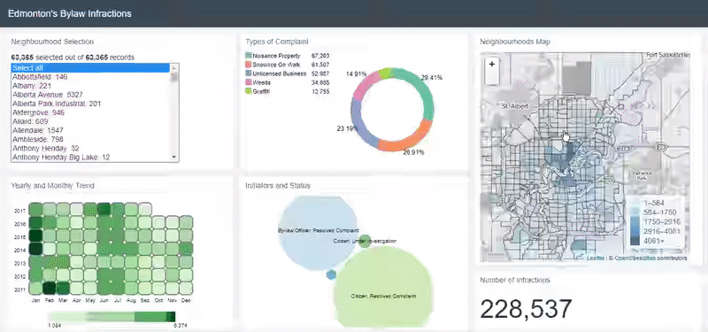
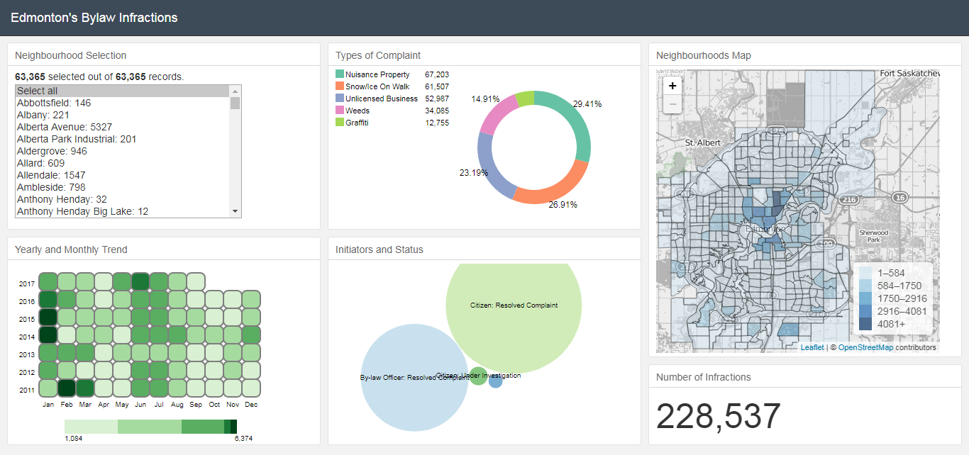
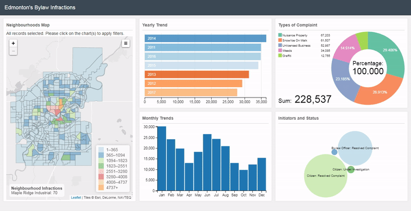
Built to analyze bylaw infractions data acquired from Open Data (City of Edmonton).
Bylaw infractions data comprises of 63,365 rows. Each row has 13 attributes as shown on aforementioned website.
The whole data set was used in this example, even though 2017 data is incomplete.
However, only 9 attributes were used to make the dashboard. Each neighbourhood has a
unique combination of: pie chart, heatmap, bubble cloud, location on the map, and
total number of infractions. The first instance of the dashboard (after data is loaded)
is select all, whereby all neighbourhoods are selected and overall sum of infractions
is displayed.
Inspiration for the project: Interactive Data Visualization of Geospatial Data and
Le choropleth
Frameworks used include: crossfilter.js, dc.js, d3.js, leaflet.js,
keen_io.js, dc_addons.js and bootstrap.js
Best viewed in: Google Chrome
Desktop Dashboard: BYLAW INFRACTIONS DASHBOARD I (CLICK ME!)
Note: CLICKABLE ELEMENTS AND MOUSEOVER, ARE DRIVERS IN REVEALING DATA INSIGHT
BYLAW INFRACTIONS DASHBOARD comprises of the following:
| Componet | Features |
|---|---|
| Selection Options (neighbourhood selection) |
|
| Pie Chart (types of complaint) |
|
| Heatmap (yearly and monthly trend) |
|
| Bubble Cloud (initiators and status) |
|
| Map (neighbourhoods map) |
|
| Number Display (number of infractions) |
|
Improvements for the dashboard include:
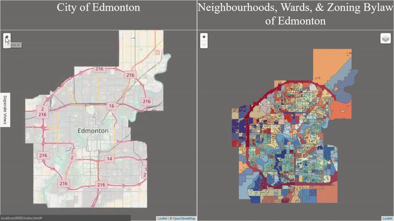
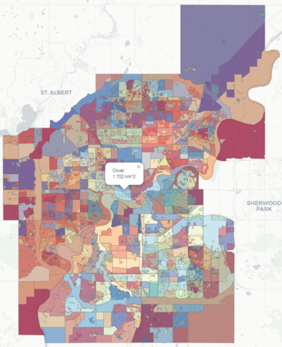
Purpose: View and explore Wards, Neighbourhoods, and, Zoning Bylaw of Edmonton
Best viewed in: Google Chrome (Desktop Map)